Underwriter Task Manager

Simplifying underwriting operations by organizing tasks

About Project

Company

Integrated Specialty Coverages

Role

Product Designer

Work

User Research, Interaction Design, Product Design

Company

Integrated Specialty Coverages

Role

Product Designer

Work

User Research, Interaction Design, Product Design

Problem

Underwriting insurance coverage applications is a cumbersome process that is driven through email. The current workflow for underwriters provides no visibility on which tasks other underwriters are working on, causing redundancy in work. There are many applications an underwriter goes through in a day, causing longer response times if the underwriter's assignment is unclear.

Solution

Design an underwriting task manager that helps visualize the status of tasks and display the assigned underwriter per task to reduce redundancy of work. To create a task manager that will streamline the underwriter workflow to reduce underwriting response time by 10%. This helps achieve the business goal of binding insurance applications faster to increase sales volume.

Impact

22%

22%

22%

22%

UW response time

13%

13%

13%

13%

In quotes

User Personas

User Research: Observation Studies

I facilitated multiple sessions with underwriters to observe and understand their workflow and current way of working. As they were going over their process, I initiated follow up questions to help divulge the reasons for the actions they took and wrote down notes to find room for improvement in their workflow and capture any frustrations.

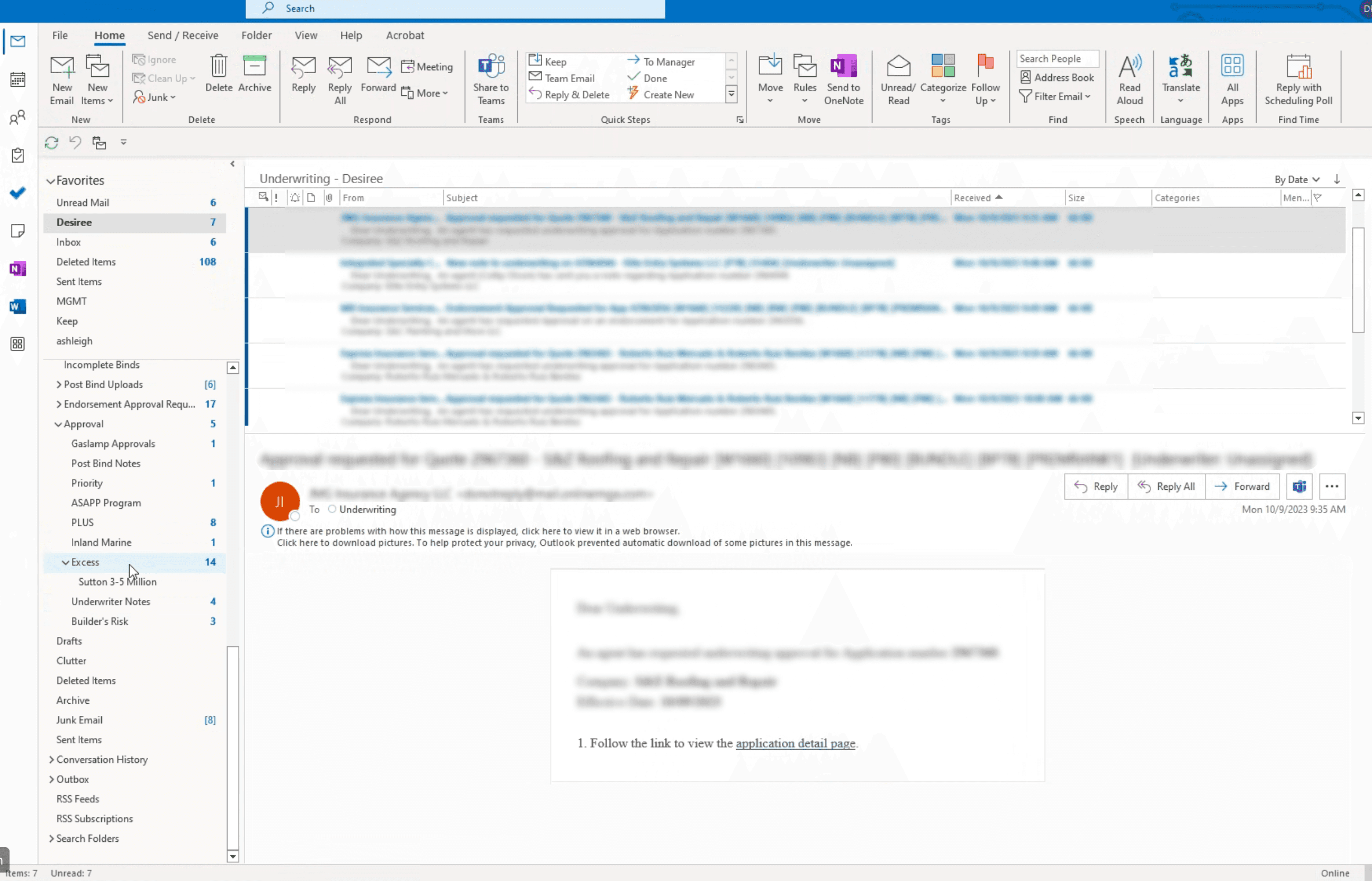
Their way of working was monitoring underwriting tasks via Microsoft Outlook and mostly driven by email, which hindered underwriting throughput.

My team and I created and vetted the user journey flow for the Agent, who submits applications for the insured, and the Underwriter, who reviews the submitted application. Creating the user journey flow helped me holistically see the decision points and effects of each action taken:

  1. Understand the triggers and actions each user takes

  2. Identify the pre-requisites that need to be completed before the Agent or Underwriter may move to the next step

  3. Identify and understand the 2nd order / 3rd order effects of actions taken by the Agent and how it affects the underwriter and vice-versa.

Screenshot of Microsoft Outlook for Original Underwriter Workflow

User Flow

From observation studies with underwriter, I was able to create a user flow to visually depict their way of working and identify points of frustration.

My team and I created and vetted the user journey flow for the Agent, who submits applications for the insured, and the Underwriter, who reviews the submitted application. Creating the user journey flow helped me holistically see the decision points and effects of each action taken:

  1. Understand the triggers and actions each user takes

  2. Identify the pre-requisites that need to be completed before the Agent or Underwriter may move to the next step

  3. Identify and understand the 2nd order / 3rd order effects of actions taken by the Agent and how it affects the underwriter and vice-versa.

Research Summary

After synthesizing my notes and the user flow from observation studies, I came up with the following insights:

My team and I created and vetted the user journey flow for the Agent, who submits applications for the insured, and the Underwriter, who reviews the submitted application. Creating the user journey flow helped me holistically see the decision points and effects of each action taken:

  1. Understand the triggers and actions each user takes

  2. Identify the pre-requisites that need to be completed before the Agent or Underwriter may move to the next step

  3. Identify and understand the 2nd order / 3rd order effects of actions taken by the Agent and how it affects the underwriter and vice-versa.

Improvement Opportunity: Email may be missed if many emails are in between same emails with the same App ID. Underwriter won’t scroll more than a few emails downward (same email has to be within viewport)

Note: Sort order of emails is First in First Out (FIFO)

Frustration Will notice sometimes that an underwriter is already working on this application, so then ends up closing the application and moving onto the next email.

Improvement Opportunity: More emails came in by the time underwriter got to the next email. Fast velocity of tasks makes it difficult to keep track of.

Inspiration

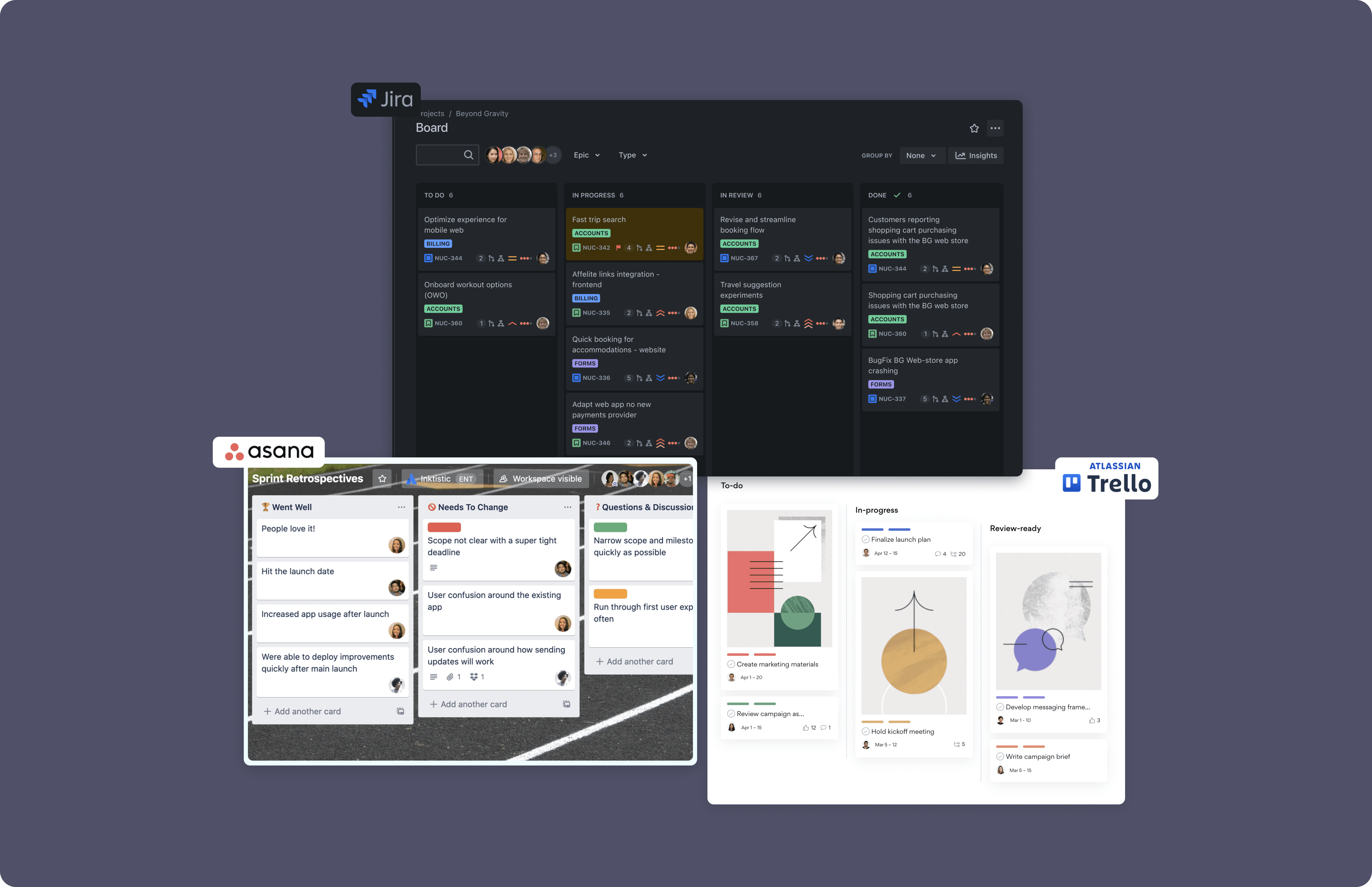
Explored existing designs that catered towards task management for inspiratinon.

My team and I created and vetted the user journey flow for the Agent, who submits applications for the insured, and the Underwriter, who reviews the submitted application. Creating the user journey flow helped me holistically see the decision points and effects of each action taken:

  1. Understand the triggers and actions each user takes

  2. Identify the pre-requisites that need to be completed before the Agent or Underwriter may move to the next step

  3. Identify and understand the 2nd order / 3rd order effects of actions taken by the Agent and how it affects the underwriter and vice-versa.

Wireframes

Created initial sketches to map out the high level sections for submission questions for insurance coverage.

My team and I created and vetted the user journey flow for the Agent, who submits applications for the insured, and the Underwriter, who reviews the submitted application. Creating the user journey flow helped me holistically see the decision points and effects of each action taken:

  1. Understand the triggers and actions each user takes

  2. Identify the pre-requisites that need to be completed before the Agent or Underwriter may move to the next step

  3. Identify and understand the 2nd order / 3rd order effects of actions taken by the Agent and how it affects the underwriter and vice-versa.

Interaction Design

Filter by Assigned Underwriter

• Underwriters are able to filter tasks by selecting an underwriter.

Filter by Assigned Underwriter

• Underwriters are able to filter tasks by
selecting an underwriter.

Task getting assigned to user (i.e., 'DR')

• Task will turn into a highlighted state to visually indicate the task has been assigned to the user (i.e., 'DR') by their manager or another underwriter.
• User can select the task to remove the highlight.

Task getting assigned to user (i.e., 'DR')

• Task will turn into a highlighted state to visually indicate the task has been assigned
to the user (i.e., 'DR') by their manager or another underwriter.
• User can select the task to remove the highlight.

Task getting assigned to user (i.e., 'DR')

• Task will turn into a highlighted state to visually indicate the task has been assigned to the user (i.e., 'DR') by their manager or
another underwriter.
• User can select the task to remove the highlight.

Task getting assigned to user (i.e., 'DR')

• Task will turn into a highlighted state to
visually indicate the task has been
assigned to the user (i.e., 'DR') by their
manager or another underwriter.
• User can select the task to remove the
highlight.

Task is auto-assigned to user when dragging to 'Working' column

• Subtle flashing of the assignee bubble is used to indicate that the task is auto-assigned to the user (i.e., 'DR') when dragging an un-assigned task into
the 'Working' column.

Task is auto-assigned to user when dragging to 'Working' column

• Subtle flashing of the assignee bubble is used to indicate that the task is auto-
assigned to the user (i.e., 'DR') when dragging an un-assigned task into the
'Working' column.

Task is auto-assigned to user when dragging to 'Working' column

• Subtle flashing of the assignee bubble is used to indicate that the task is auto-assigned to the user (i.e., 'DR') when dragging
an un-assigned task into the 'Working' column.

Task is auto-assigned to user when dragging to 'Working' column

• Subtle flashing of the assignee bubble
is used to indicate that the task is auto-
assigned to the user (i.e., 'DR') when
dragging an un-assigned task into
the 'Working' column.

Move task with same application ID to 'Working' column

• Modal is displayed to prompt the user to move tasks with the same application ID to the 'Working' column, when dragging a task that has the same
application ID of another task.
• Tasks will also be auto-assigned to the user that drags the task into 'Working' column (i.e., 'DR').

Move task with same application ID to 'Working' column

• Modal is displayed to prompt the user to move tasks with the same application ID to
the 'Working' column, when dragging a task that has the same application ID of
another task.
• Tasks will also be auto-assigned to the user that drags the task into 'Working'
column (i.e., 'DR').

Move task with same application ID to 'Working' column

• Modal is displayed to prompt the user to move tasks with the same application ID to the 'Working' column, when dragging a
task that has the same application ID of another task.
• Tasks will also be auto-assigned to the user that drags the task into 'Working' column (i.e., 'DR').

Move task with same application ID to 'Working' column

• Modal is displayed to prompt the user
to move tasks with the same
application ID to the 'Working' column,
when dragging a task that has the
same application ID of another task.
• Tasks will also be auto-assigned to the
user that drags the task into 'Working'
column (i.e., 'DR').

UX Improvements: User Feedback and Analytics

30+

30+

30+

30+

Beta Users

Beta Users

9%

9%

9%

9%

Underwriter Efficiency

Used Hotjar to gather user feedback and analytics

Challenge

I needed to advocate for the user and propose we should also utilize a user analytics tool for the underwriter task manager, even though we had already seen improvements in underwriter response time. I pointed out how Hotjar (user analytics tool) proved to be useful with analyzing user behavior on our other products.

Improvement #1: Including Subtypes for Bind Team

Underwriters from the Bind Team need to know the specific subtypes of the tasks to know who to assign it to and to provide additional context of what is needed from underwriters to complete the task. As a result, we added the following subtypes:

• Deposit required
• Renewal
• PremRank1
• Claims

Improvement #2: Admin Data View

Underwriter managers expressed needing a view to track task completion rate for underwriters. As a result, we added a 'bar' icon in top right corner of the page and clicking the icon will toggle to Data View for Admin users.

Improvement #3: Added Control Bar to Batch Select Tasks and Assign Assignees or Change Status

After witnessing the common behavior of having to tediously modify tasks one by one, whether it was for assigning assignees or for changing statuses, we noticed not having the ability to batch select or multi-select tasks was an opportunity to delight users.

Batch Select: Multi-assign Assignees (i.e., assigning multiple tasks to Tod Watson)
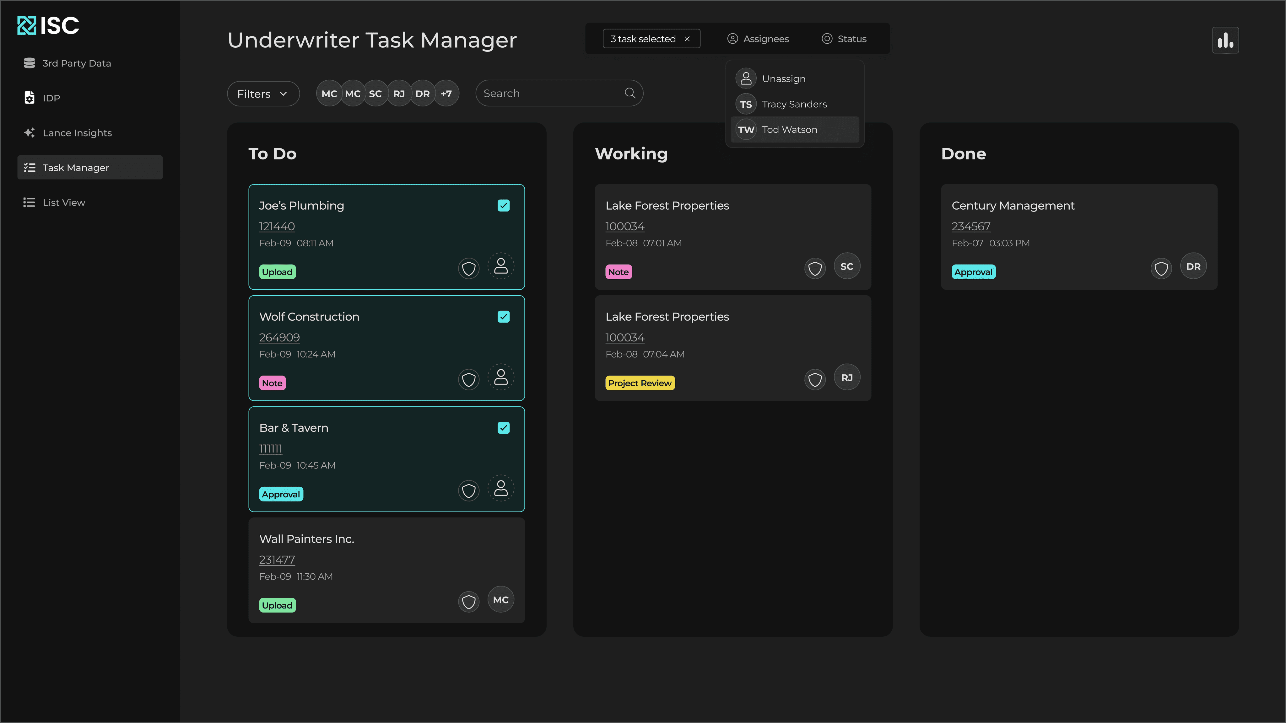
Batch Select: Change Status for Multiple Tasks (i.e., changing status to from 'To Do' to 'Done' for multiple tasks)

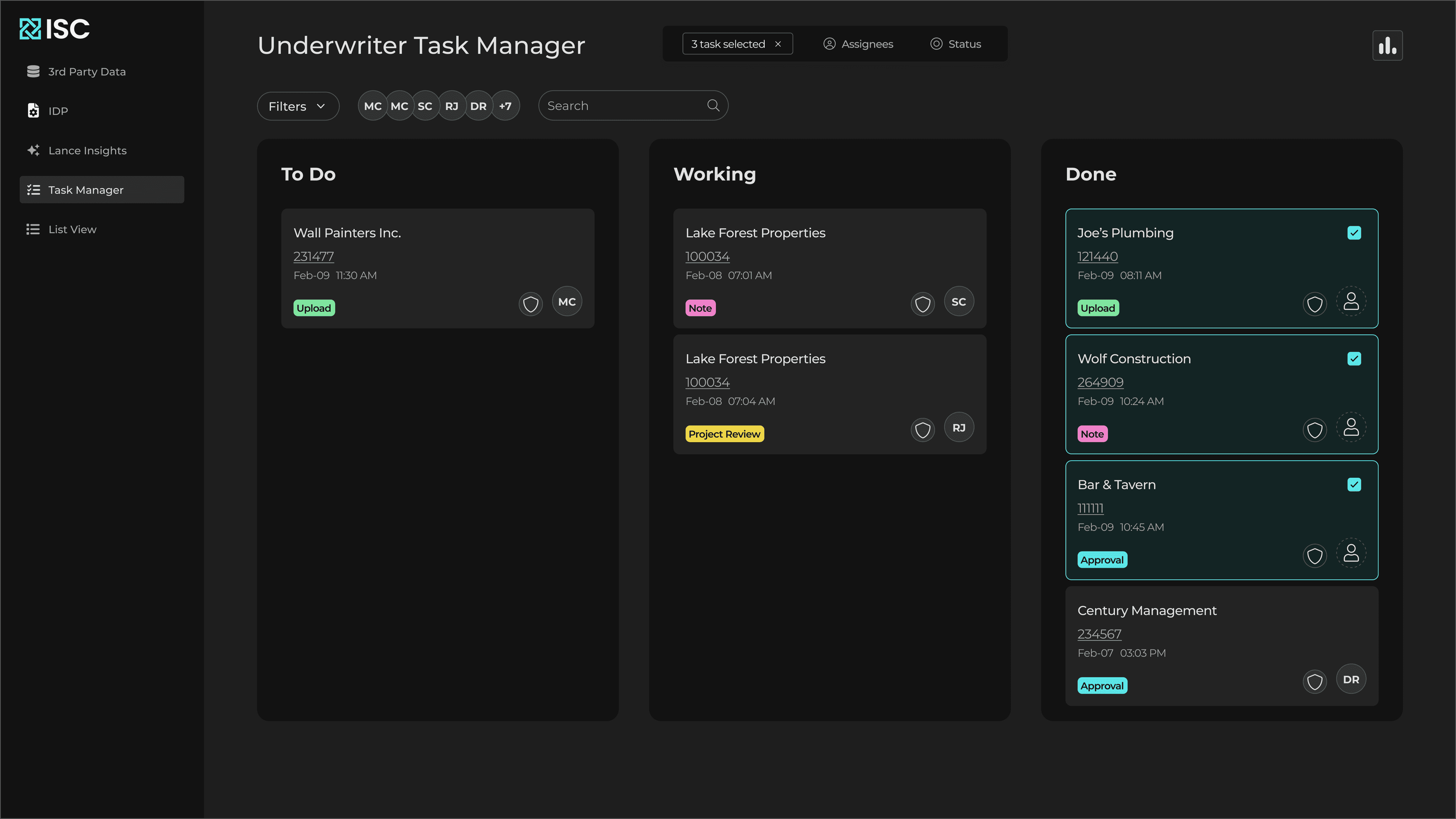
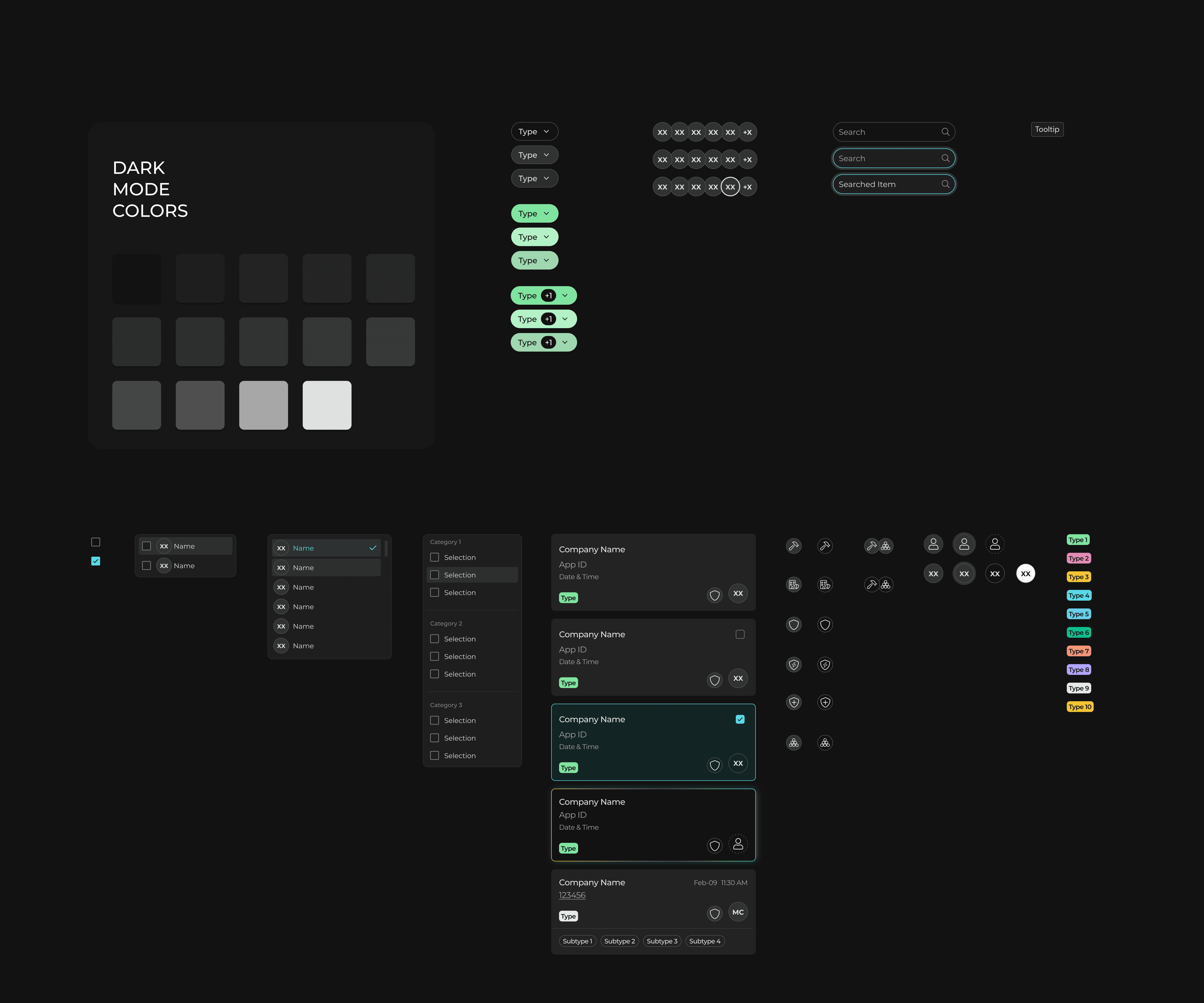
Dark Mode: Component Library

Introduced dark mode for this software product to reduce eye strain for underwriters.

Context: Underwriters go through many tasks at a fast velocity and look at their computers for long periods of time.