NewHope Logistics
Company website for freight forwarding logistics

About Project
Problem
NewHope Logistics Inc. lacks an established online presence. The company needs a marketing website for company growth and visibility to obtain new customer leads.
Solution
Design a marketing website to grow NewHope Logistics' online presence that clearly communicates the value the company provides and how its services are competitive within the logistics market.
Impact
Customer growth
In revenue
Competitive Analysis
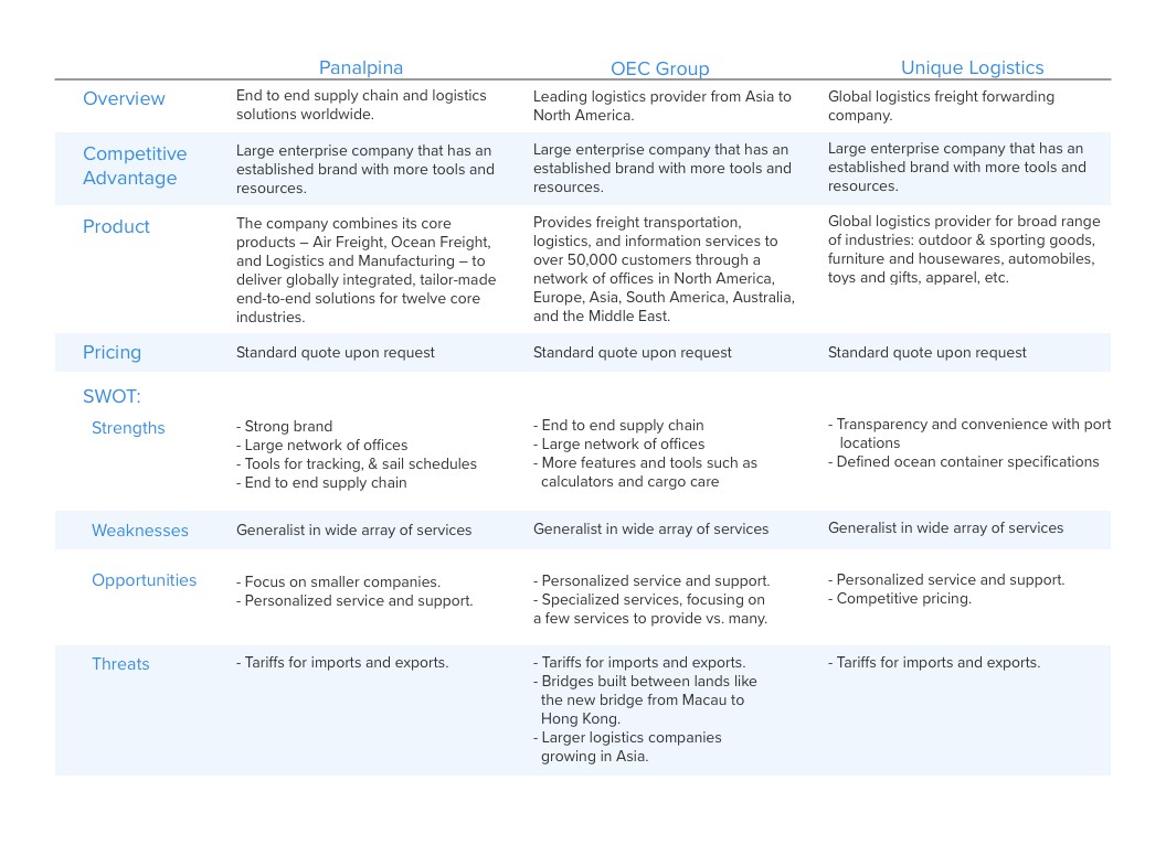
I highlighted other freight forwarding logistics companies such as Panalpina, OEC, Group, & Unique Logistics. These are large corporations that provide a wide array of services. However, none of them service smaller/mid-size companies and do not provide personalized service and support.
From the competitive analysis, I want the website to emphasize on how NewHope Logistics Inc. provides personalized or customized services and responsive support.
User Research
I conducted live interviews with supply chain professionals to better understand their motivations for partnering with logistics companies and the problems they face.

User Persona
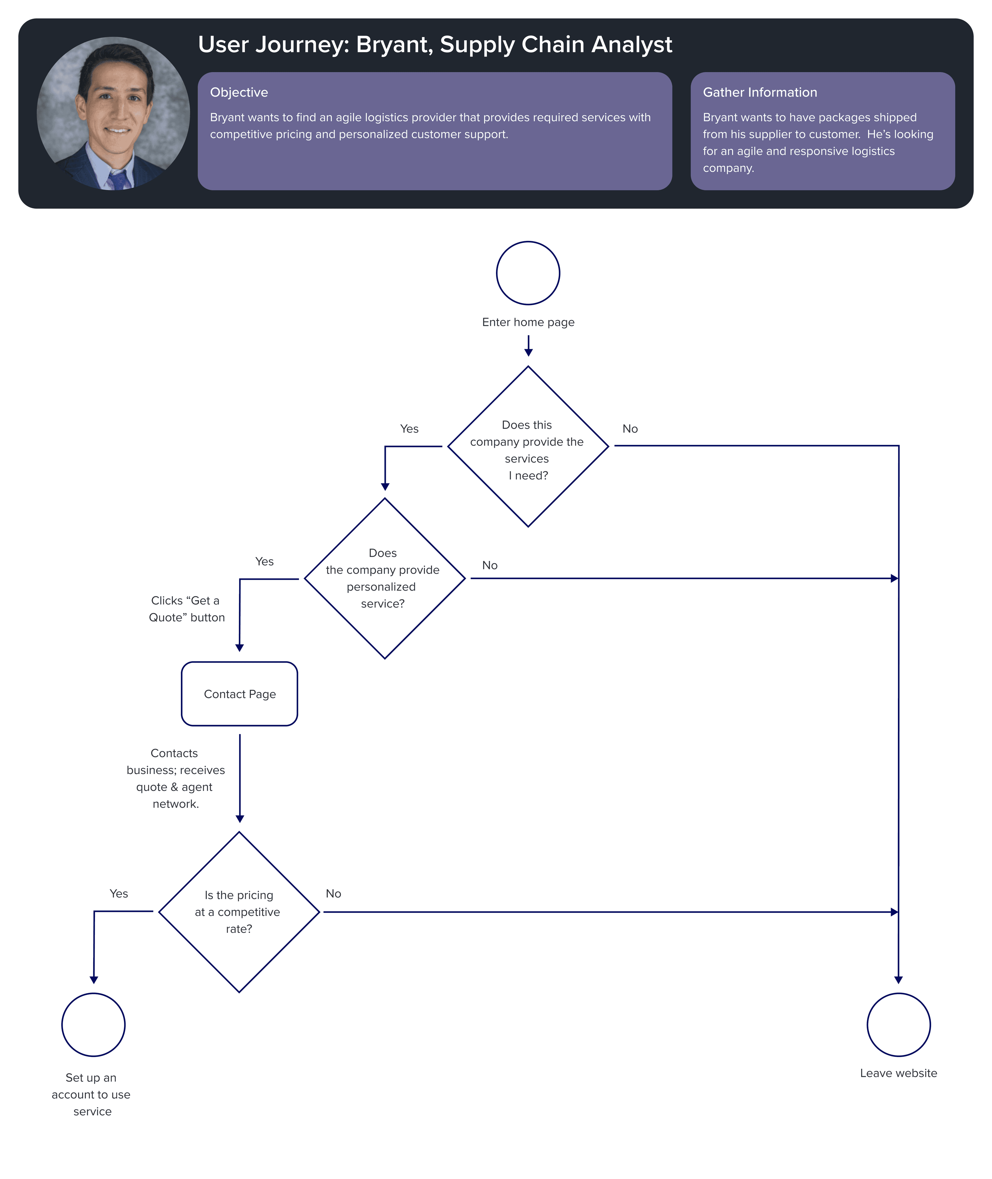
Based on the interviews, I created a user persona named Bryant, a supply chain analyst who seeks to improve his company finances by receiving responsive customer support and clear tracking of shipments from his logistics partner.
User Journey Map & User Task Flows
From journey mapping, I found that there is a drop in emotion that the company website can't provide transparent quote pricing and has to receive this information via phone. This is due to resource constraints of the company.
I recommended to the product team that transparent pricing needs to be added.
From user task flows, I was able to draw out interaction flows to help me prep my sketches and wireframes.
Wireframes
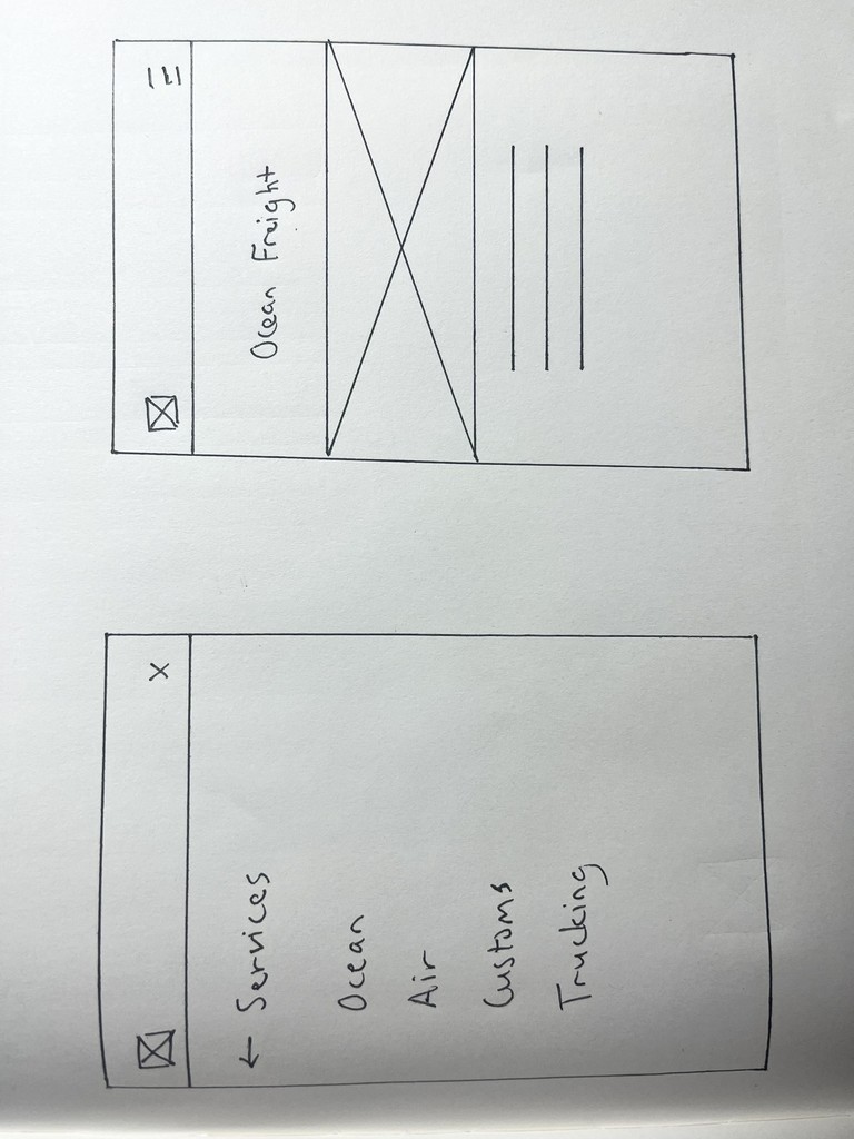
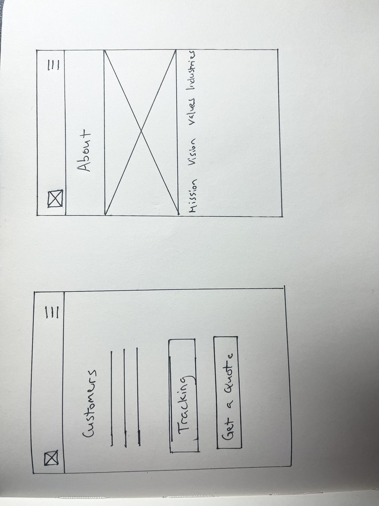
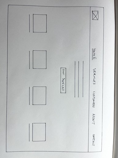
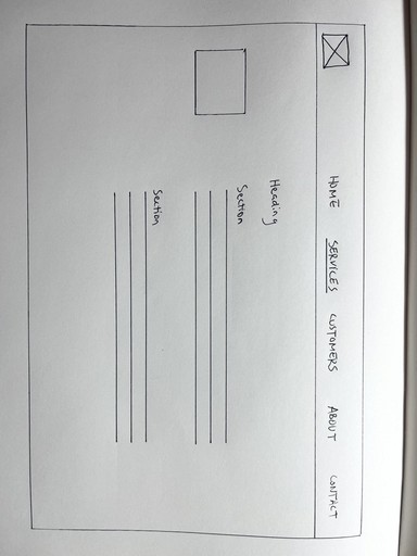
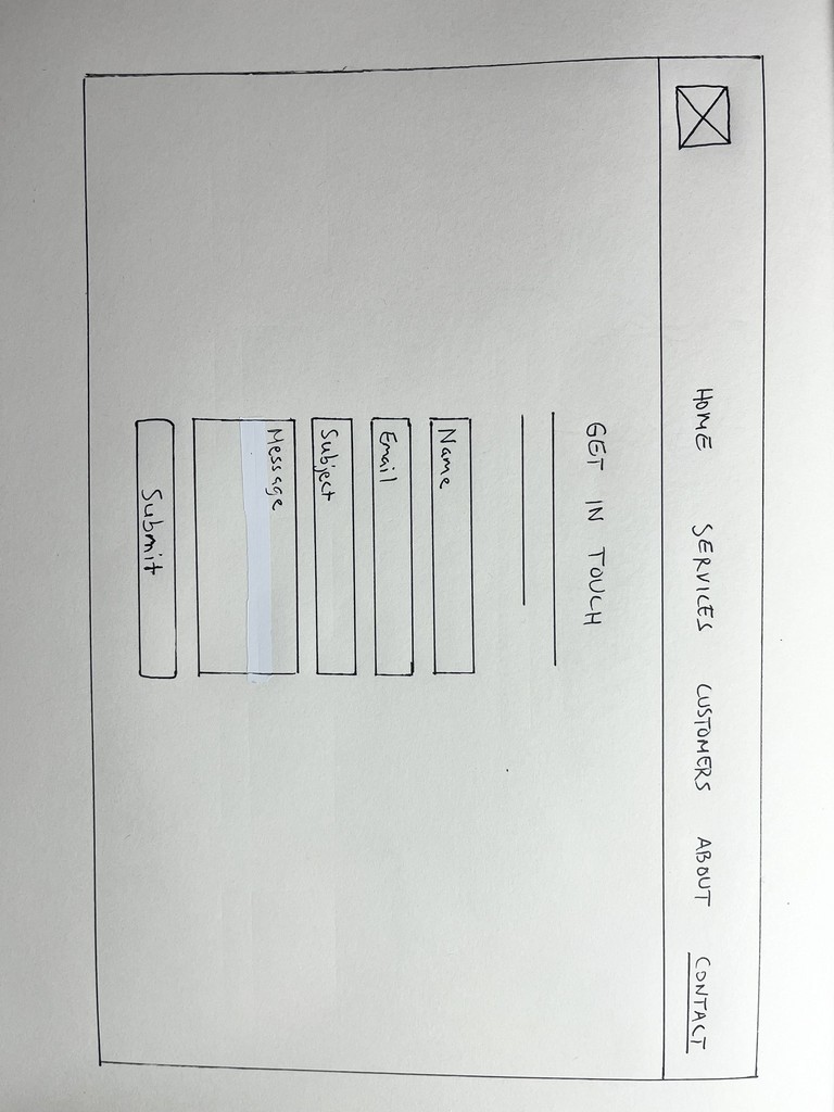
I started with low fidelity sketches to help me rapidly change designs and have an idea of how to translate my user stories, interview insights, and task flows. These sketches were especially useful in communicating initial design ideas with users to get early user feedback.
Prototyping
I created a clickable mobile prototype with medium fidelity designs using Sketch to allow users to navigate through interactions. Used Sketch Mirror to mirror screens on mobile device.
Usability Test
I conducted 3 moderated in person tests for mobile view version of the NewHope Logistics Inc. website. The overall goal of the test was to find gaps and areas that the web app mismanaged user expectations.
Tools Used: QuickTime Player for face and screen recording and Sketch Mirror. I used the rainbow spreadsheet template to help me organize findings and extract valuable user feedback.
Objectives:
1. Determine if company services are clear on the landing page.
2. Ensure accurate UX/content writing. Verify if the correct terminology is used for the freight forwarding industry.
1. Usability tests showed that users forget company name as they navigate through pages. Always have company name in header of mobile design. Many responsive mobile designs exclude this to save space.
2. User did not understand what the company did or what its value was from looking at home page. This pushed me to display a simple and clear tagline.
3. Improve content writing by using language such as "our, we, etc." from a 1st person point of view on the "About" page.
Information Architecture
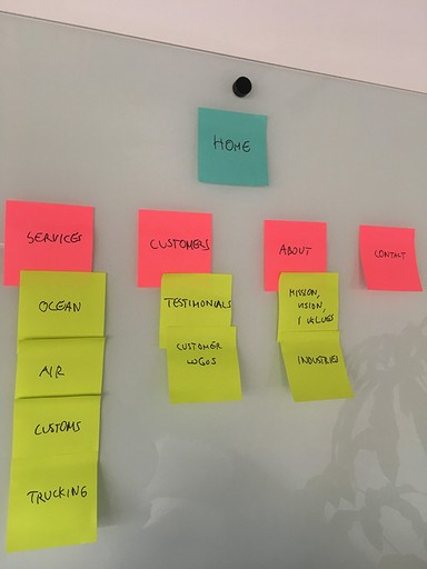
The usability tests results also pushed me to change my site map with the content under the "Customers" page. I learned that users expected the "customers" page to show customer testimonials, when in reality the page showed customer tools. I revised the site map to align with user expectations. In the end, it we moved the 'tracking' action to the home page due to customer feedback showing it's a highly used action and removed 'get a quote', due to the constraints involved with providing tools for getting a quote for customers.
UI Design
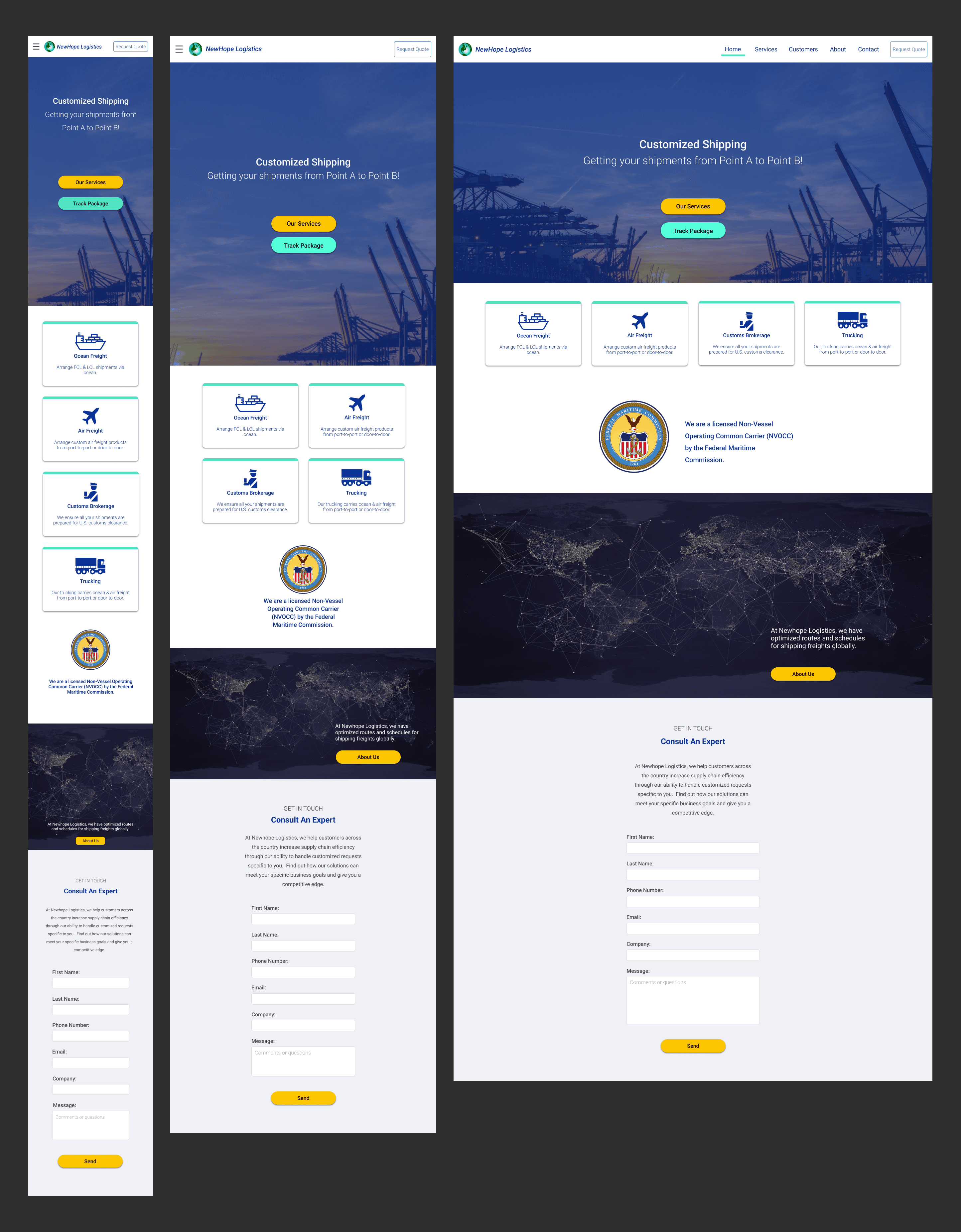
At last we arrive at the final recommended design, which includes responsive design to view on mobile, tablet, and desktop.
I say "recommended" because some features were taken out due to limited company resources. Taken out features include "request quote" feature.
The landing page uses the keyword 'Customized' to highlight the differentiating value from larger enterprise companies and has a simple tagline to clearly communicate the value of the company.
Key Takeaways
1. Always have company name in header of mobile design. Many responsive mobile designs exclude this to save space. Usability tests showed that users forget company name as they navigate through pages.
2. Be careful on how links are named in the navigation bar. Ensure link title aligns with user expectations (i.e. Customers page).
Things I'd improve on if given more time and resources:
Design a dashboard for showing tracking packages via ocean, air, trucking, and passing customs and test if data is organized in an optimal way for users.
Strategize on adding more content to show how NewHope Logistics Inc. provides personalized support (ex: shipping process steps).
