OMGA Redesign
Redesign of OMGA insurance platform

About Project
Problem
The OMGA product continually received a lot of tickets for worker pertaining to usability issues (e.g., user error, confusion, frustration, etc.), which made it difficult for Agents and Underwriter to do their jobs at an optimal level. The product also needed a rebrand with its visual design to stay up to date along with its competitors.
Solution
Redesign the OMGA product to solve the most common and frustrating usability issues using evaluative research methods and following usability heuristics. On the visual design end, new branding guidelines and style guides are needed to revamp the look and feel of the product.
Tickets on usability
On usability (survey data)
Sold premium per year
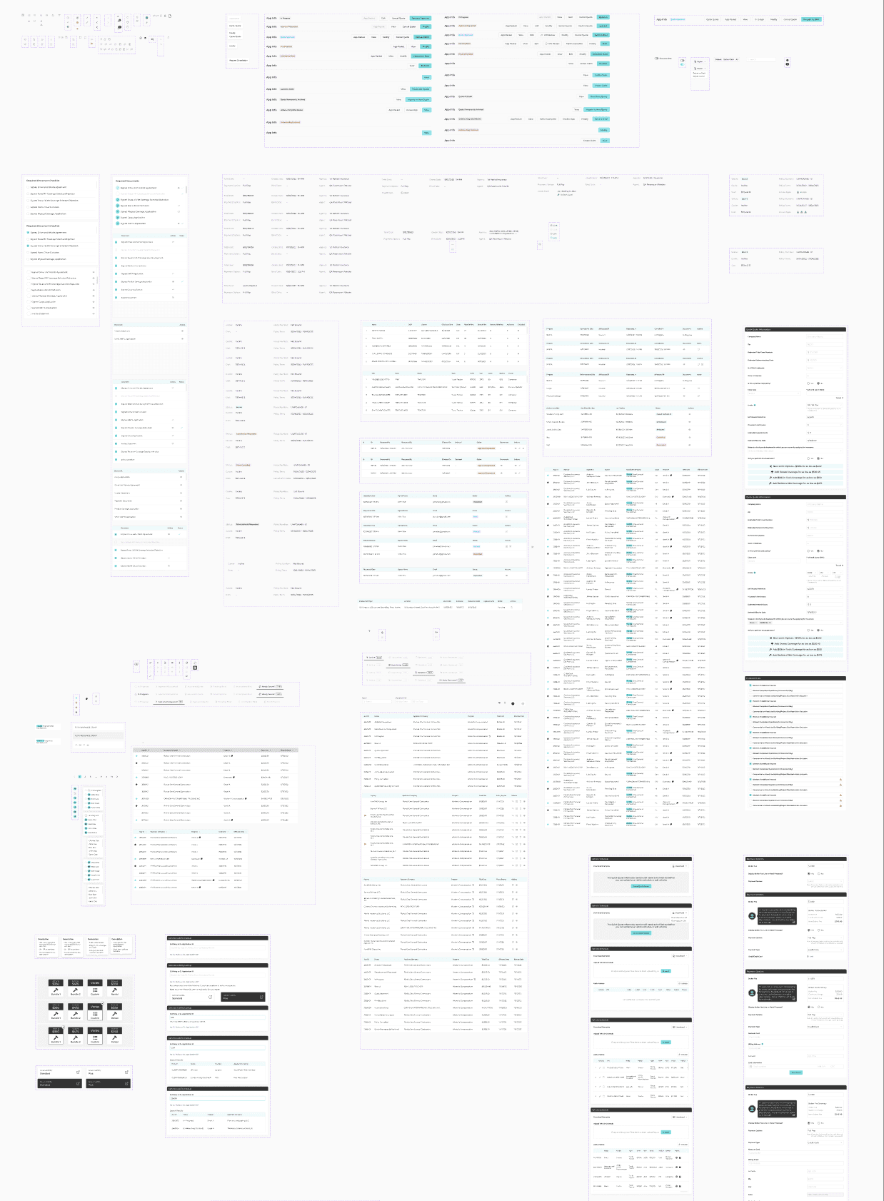
Pages
Evaluative Research with Surveys
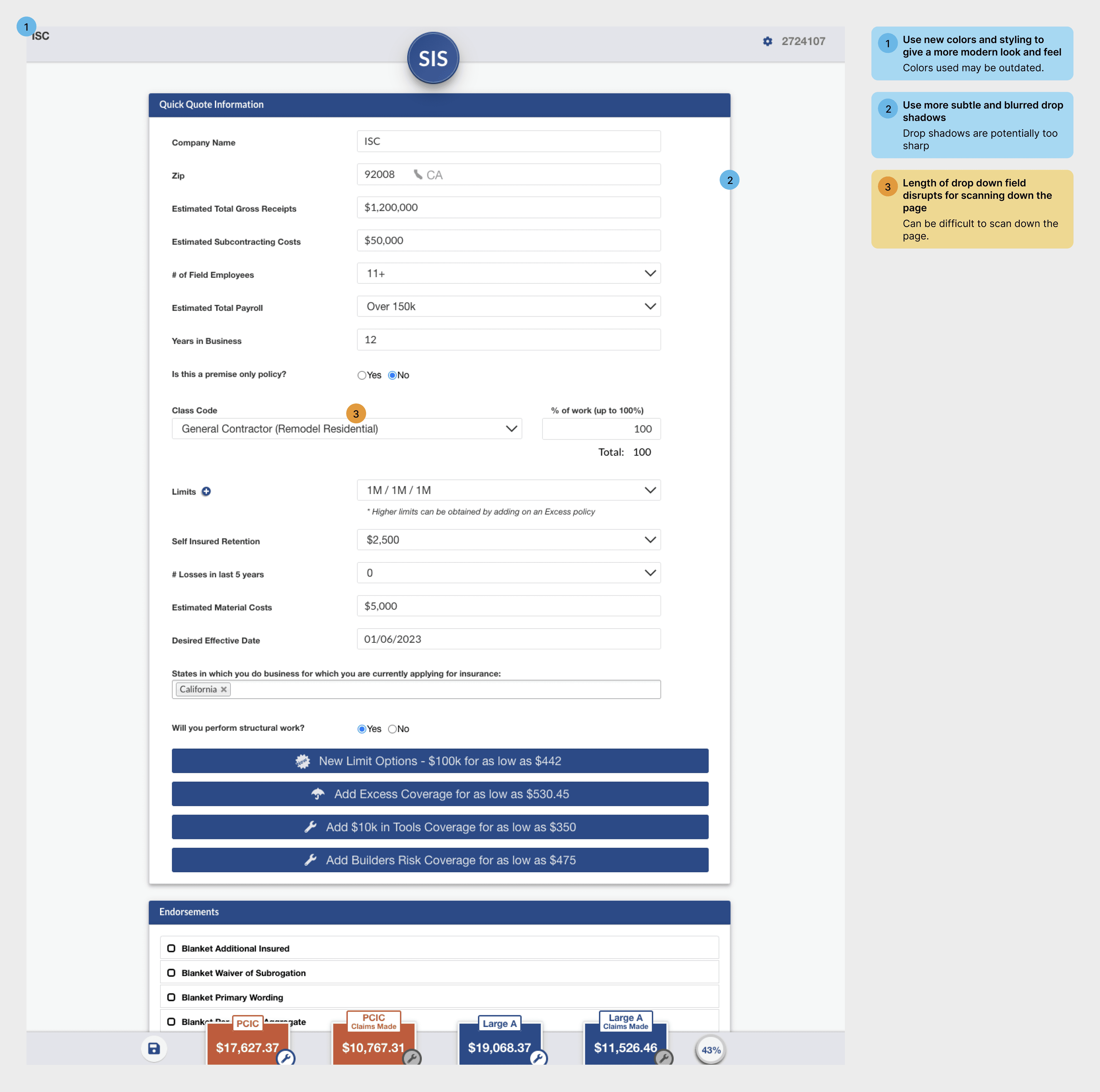
I led evaluative research sessions with users by gathering survey feedback on the OMGA's usability. The survey results showed that there many usability issues that needed to be improved or fixed. I've detailed a few examples below applying usability heuristics to improve the usability and visual design.
Legend


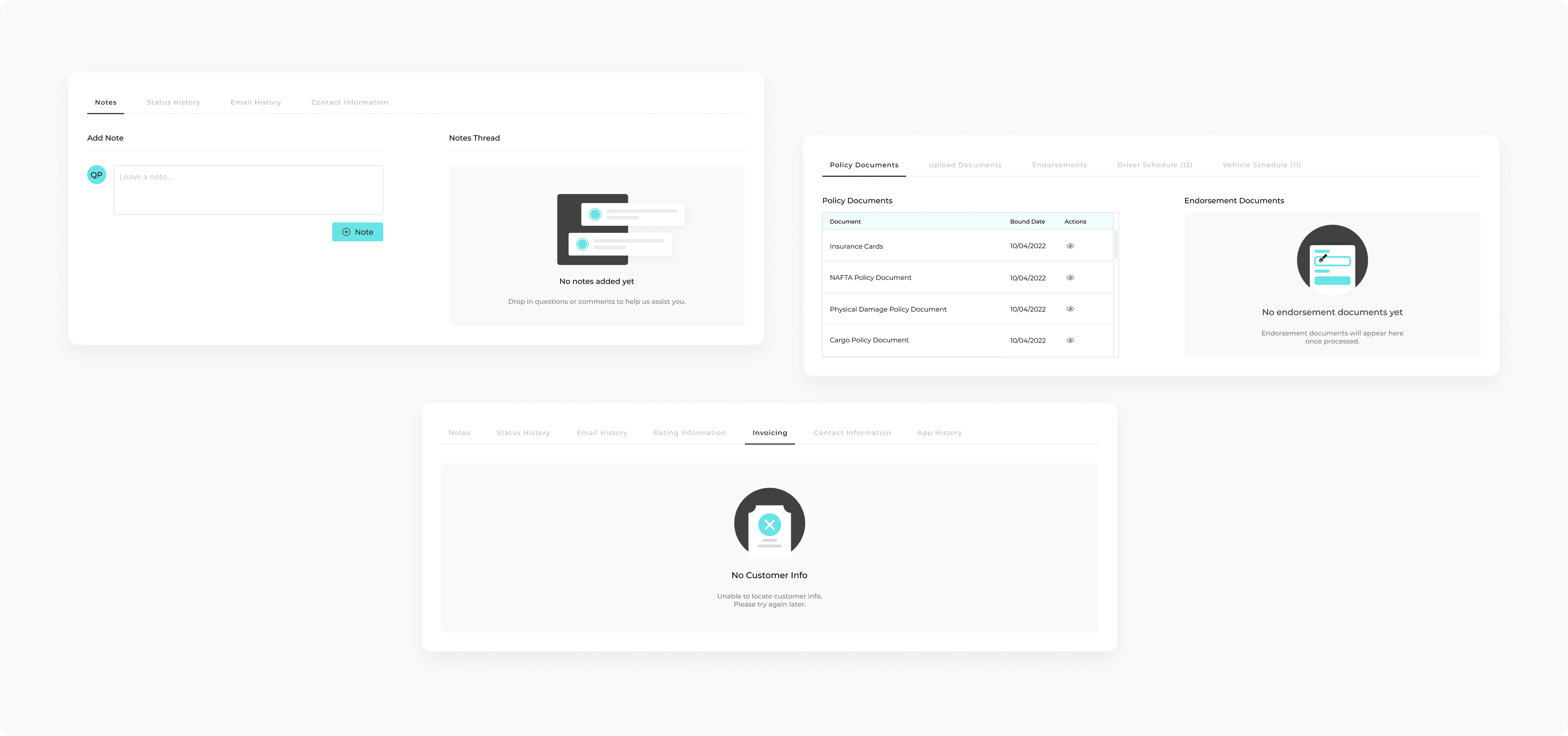
Final Design
After conducting an audit of the existing UI and looking through my analysis and notes, I redesigned the UI to improve usability and aesthetic design for a more modern look and feel.

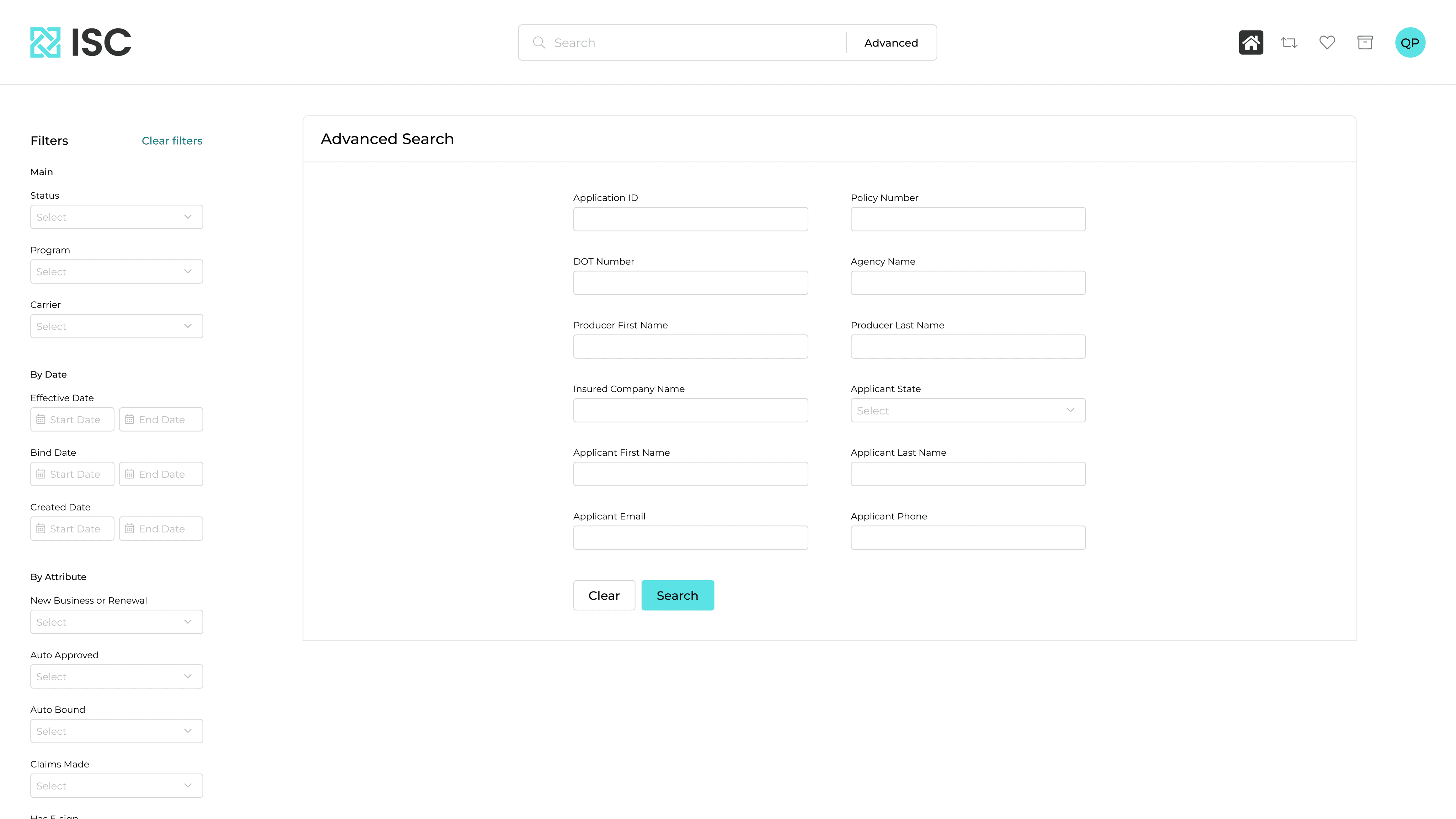

Additional Usability Improvements
Adding empty states to provide context to the user that content will appear within the applicable scenario. The original design did not include empty states.

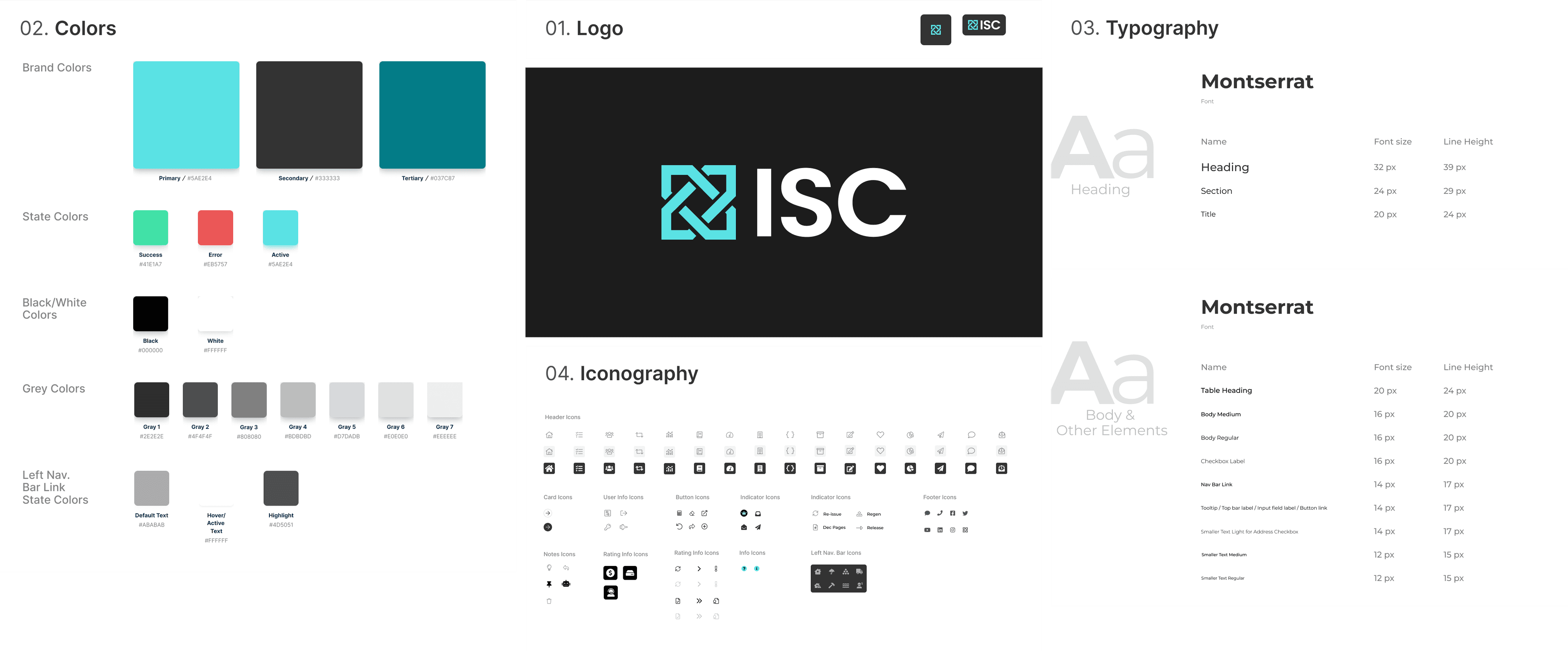
Style Guide